• Thanks for visiting The Penturners Forum today.

    There are many features and resources that currently you are unable to see or access, either because you're not yet registered, or if you're already registered, because you're not logged in.

    To gain full access to the forum, please log in or register now. Registration is completely free, it only takes a few seconds, and you can join our well established community of like-minded pen makers.

Laburnum Fattop

paulm

grave manibus faciendum
Registered
Joined
Oct 7, 2013
Posts
12,046
Location
Sandford
First Name
Paul
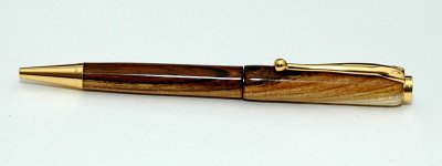
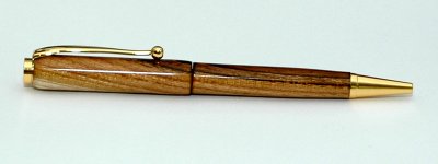
A Laburnum Fattop finished with ca. My apologies to whoever gave me this lovely piece of wood, I forgot who it was.

I had to look twice at the pen as it looks like there's a gap in the middle but its just a reflection of the light
 

Attachments

  • laburnum1.jpg
    laburnum1.jpg
    162.8 KB · Views: 52
  • laburnum2.jpg
    laburnum2.jpg
    164.8 KB · Views: 51

Paul

Fellow
Joined
Oct 22, 2013
Posts
1,053
Location
Kent
May I be so bold? The grain match is spot on, and the finish is very classy, but I'm not sure if the distinction between the two sizes is big enough IMHO, as the curve is missing on to the middle band area is not there, it could look like you have down two perfectly matched and finished halves, but at slightly different sizes, a bit like a wall of text with slightly different font sizes?

Ie, is the difference intentional or accidental etc? Just my two pence. But I would love to be able to do that myself etc
 

Grump

Grand Master
Joined
Aug 17, 2013
Posts
10,510
Location
Stevenage
First Name
Brian
Nope sorry mate, I hate it.
Laburnum too nice, shine to much and fits too well init?
Put it in the post to me and I'll burn it for you.
 

paulm

grave manibus faciendum
Registered
Joined
Oct 7, 2013
Posts
12,046
Location
Sandford
First Name
Paul
May I be so bold? The grain match is spot on, and the finish is very classy, but I'm not sure if the distinction between the two sizes is big enough IMHO, as the curve is missing on to the middle band area is not there, it could look like you have down two perfectly matched and finished halves, but at slightly different sizes, a bit like a wall of text with slightly different font sizes?

Ie, is the difference intentional or accidental etc? Just my two pence. But I would love to be able to do that myself etc

You are right Paul. Normally when I make these pens I do make a bigger distinction between top and bottom but the blank for this was fairly small so I didn't have any choice. While in the hand it looks ok, I should have made it a streamline probably.
 

Woody

Registered
Joined
Jul 12, 2013
Posts
12,812
Location
at home
First Name
no
Amazing Paul just amazing but then what else would we expect from you love it mate
 

Jim

Grand Master
Joined
Oct 19, 2011
Posts
15,617
Great looking pen, with a great finish to it, but i can see where Paul is coming from here, maybe rounding off the bottom barrel at the centre would had been the answer .. :thinks:

No taking anything away from the workmanship that has gone into the making of the pen my friend .. :thumbs:
 
Warning! This thread has not had any replies for over a year. You are welcome to post a reply here, but it might be better to start a new thread (and maybe include a link to this one if you need to).
Top