• Thanks for visiting The Penturners Forum today.

    There are many features and resources that currently you are unable to see or access, either because you're not yet registered, or if you're already registered, because you're not logged in.

    To gain full access to the forum, please log in or register now. Registration is completely free, it only takes a few seconds, and you can join our well established community of like-minded pen makers.

Mistrals using Marla's Feathers

Chriscb

Full Member
Joined
Feb 23, 2014
Posts
205
Location
Sutton Coldfield
First Name
Chris
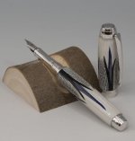
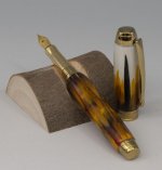
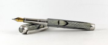
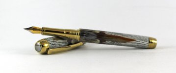
A pair of Mistral pens in Marlas Feather acrylic blanks. Gold and Golden Pheasant and Rhodium with Silver Pheasant and dyed Rooster cape. Both with Bock #5 (F) nibs.

As ever, critiques and comments please.

Regards,
Chriscb
 

Attachments

  • 200303_i mist feather_0000_Layer 2.jpg
    200303_i mist feather_0000_Layer 2.jpg
    43.3 KB · Views: 135
  • 200303_i mist feather_0001_Layer 1.jpg
    200303_i mist feather_0001_Layer 1.jpg
    41.9 KB · Views: 136

Tiny James

Full Member
Joined
Oct 13, 2020
Posts
194
Location
Rugby
First Name
James
They are fantastic you have managed to raise the bar of pen turning to new heights

James
 

fortress

Registered
Joined
Apr 11, 2016
Posts
5,178
Location
Astley
First Name
John
They are stunning Chris, well done to you, very different and very pleasing on the eye. :drool::drool::thumbs:
 

Penpal

Grand Master
Joined
May 26, 2013
Posts
25,342
Location
Canberra AUSTRALIA
First Name
Peter
Thanks Crisch,strong masculine pens always love Marlas Feathers and other blanks ,you too Pete the enabler for your backing up.

Kind regards all round Peter. and Merry Christmas already.
 

Bammer

Fellow
Joined
Oct 5, 2015
Posts
1,494
Location
Cambridge
First Name
Brad
They are fantastic you have managed to raise the bar of pen turning to new heights

James

They are very nice that's for sure. But raising the bar of pen turning to new heights ? I don't think so James.

To be honest, I think they are under turned and not turned to the correct size. Nothing to do with fat pens or different shapes. But the way they are rounded at the ends to the components doesn't look right to me. It's this effect that shows they were not turned to the bushes, this of course is just an opinion ..... but i suppose this could be an optical illusion.

Marla Christensens blanks are stunning. I have turned loads of them, made with PR so they polish up like glass.

Queens Silver Pheasant 4.jpg

Brad
 

Attachments

  • Queens Ringneck Pheasant 4.jpg
    Queens Ringneck Pheasant 4.jpg
    152.8 KB · Views: 32

AllenN

Fellow
Joined
May 20, 2013
Posts
2,245
Location
Lancaster, UK
First Name
Allen
They are nice pens but the slightly bulbous shape is really a matter of aesthetic taste. For some pens I find it can make it feel nice in use but for others it can make the pen look rather bloated. I think that for the Mistral a completely flat profile can also look rather strained but to my mind that choice on behalf of the maker is what it is all about.
 

Chriscb

Full Member
Joined
Feb 23, 2014
Posts
205
Location
Sutton Coldfield
First Name
Chris
They are very nice that's for sure. But raising the bar of pen turning to new heights ? I don't think so James.

To be honest, I think they are under turned and not turned to the correct size. Nothing to do with fat pens or different shapes. But the way they are rounded at the ends to the components doesn't look right to me. It's this effect that shows they were not turned to the bushes, this of course is just an opinion ..... but i suppose this could be an optical illusion.

Marla Christensens blanks are stunning. I have turned loads of them, made with PR so they polish up like glass.

View attachment 42867

Brad

A fair critique, thank you. As mentioned elsewhere some pens can cope with fat or bulbous bodies, whilst others, such as a simple slimline needs to be turned precisely to the bushes to maintain the line from end to tip. I do not like an obvious step from the turned material to the metal work either. My technique for the pens in question is to accentuate the taper in the barrel, which is matched in the cap. To my eye, it works. Less importantly, (but I guess essentially) my customers agree.

Vive la differance.

Regards,
Chriscb
 
Warning! This thread has not had any replies for over a year. You are welcome to post a reply here, but it might be better to start a new thread (and maybe include a link to this one if you need to).
Top