-
Thanks for visiting The Penturners Forum today.
There are many features and resources that currently you are unable to see or access, either because you're not yet registered, or if you're already registered, because you're not logged in.
To gain full access to the forum, please log in or register now. Registration is completely free, it only takes a few seconds, and you can join our well established community of like-minded pen makers.
You are using an out of date browser. It may not display this or other websites correctly.
You should upgrade or use an alternative browser.
You should upgrade or use an alternative browser.
Pastor of Muppets
Full Member
oooh a photoshop battle?
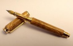
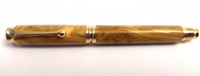
Great pen though I love olive!
Great pen though I love olive!
Cumbrian Craig
Fellow
I really like the pen, a nice blank well turned. 

Regards
Craig


Regards
Craig
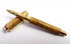
Nice looking Pen Tony Hope you don't mind but does this look better I am sure others maybe able to improve on it
Hi Derek - not a problem what programme did you use to clean up the image?
Tony
Hi Derek - not a problem what programme did you use to clean up the image?
Tony
Windows Live Photo gallery it is one that is on my computer
Penpal
Grand Master
The live gallery sure did the trick Derek, my thought was the background similarity in the original swallowed what is a very good pen.The caramel colour of the Olive is neat Tony. Beaut pen.
Peter.
Peter.
The live gallery sure did the trick Derek, my thought was the background similarity in the original swallowed what is a very good pen.The caramel colour of the Olive is neat Tony. Beaut pen.
Peter.
Thanks Peter - It's one of the choice blanks that I cut from a thick board back in August.
Tony
wm460
Grand Master
- Joined
- Mar 16, 2013
- Posts
- 23,113
- First Name
- Mark
Great looking pen Tony.


Les ELm
Executive Member
Great looking well turned and finished timber.
Nicely
 done.
done.
Les
Nicely

 done.
done.Les
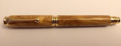
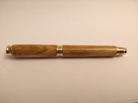
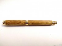
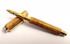
Thanks Derek - yes, that does it more justice.
I've tweaked the other photos as well - attached
View attachment 35075 View attachment 35076 View attachment 35077
Tony
They look better the great thing is if they don't look right you can undo what you did not the most fancy editor but it does the job for me. Something else that sometimes help is stand back so the pen is smaller in the frame then zoom in rather than stand close and get it all in one shot
They look better the great thing is if they don't look right you can undo what you did not the most fancy editor but it does the job for me. Something else that sometimes help is stand back so the pen is smaller in the frame then zoom in rather than stand close and get it all in one shot
I hadn't knowingly used it before. But have to admit that it's quick, simple, does the job AND you can go back if you make errors.
Tony
sammy
Graduate Member
Great looking pen, you've made the best of a lovely piece of wood. 

George


George

