• Thanks for visiting The Penturners Forum today.

    There are many features and resources that currently you are unable to see or access, either because you're not yet registered, or if you're already registered, because you're not logged in.

    To gain full access to the forum, please log in or register now. Registration is completely free, it only takes a few seconds, and you can join our well established community of like-minded pen makers.

Second Attempt (and not acrylic!)

Gregory Hardy

Graduate Member
Joined
Jul 7, 2017
Posts
454
Location
Upper New York State
First Name
Greg
"Endeavor to persevere." -Chief Dan George

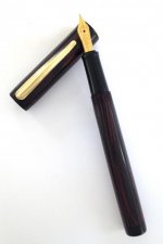
In my quest to make pens without kits, this is my second go at it. This one is Cumberland ebonite with black ebonite trim and section. The nib is a Bock #5 in gold plate with Beaufort reservoir. The clip is also gold plate. (It also is from Beaufort Ink. I have searched for months to find clips with online measurements. Good Mr. Dart has the common sense to actually present the ID/OD measurements so one can choose a clip to fit the pen - not the reverse. Simply liberating!)

Threads get better. Size gets better. Only sixty or seventy more and I think I'll be on to something!
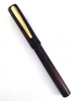
Kitless 2 Closed.jpg

Kitless 2 Open.jpg
 

Penpal

Grand Master
Joined
May 26, 2013
Posts
25,342
Location
Canberra AUSTRALIA
First Name
Peter
Greg the step down at the centre allows for a superior open pen shape, great execution, top finish mate with perfection your progress is amazing.

Peter.
 

Phil Dart

Moderator
Executive Member
Joined
Nov 28, 2014
Posts
5,491
Location
Colebrooke, Devon
First Name
Phil
Very nicely done Greg. If I had one tiny observation, which has got nothing to do with your workmanship or concept, it's that the contrast at the accents (the centre band and both finials) is a bit lost because their colour, being black, is quite close to the barrel and cap, which are quite dark. But that is just my opinion and taste, and I'm sure many will disagree with me. It may also be a just a case of the photo giving a false impression.

It doesn't take away from the fact that it's still a lovely pen though. Really well done.
 

Gregory Hardy

Graduate Member
Joined
Jul 7, 2017
Posts
454
Location
Upper New York State
First Name
Greg
And that is my criticism of self. (I also would like the cap to taper a bit toward the end, but I haven't made my masterpiece yet!) I gambled on the possibility that the red/black Cumberland ebonite might seem redder upon polishing. I learned otherwise. I am going to make this same pen again with silver rings between red and black just to separate some visual things. My poor photography didn't help - but the fact remains that contrast - one of the basic seven points of design - is still not what I want.

Just buckle your seatbelts, mates. I won't go down without a fight! "(Hold my beer and watch this!")

Thanks for the kind words, all. I post lots of things on lots of forums. I come back here like "coming home after a long time away," where the good folks reside.

Make pens.
 
Warning! This thread has not had any replies for over a year. You are welcome to post a reply here, but it might be better to start a new thread (and maybe include a link to this one if you need to).
Top