-
Thanks for visiting The Penturners Forum today.
There are many features and resources that currently you are unable to see or access, either because you're not yet registered, or if you're already registered, because you're not logged in.
To gain full access to the forum, please log in or register now. Registration is completely free, it only takes a few seconds, and you can join our well established community of like-minded pen makers.
You are using an out of date browser. It may not display this or other websites correctly.
You should upgrade or use an alternative browser.
You should upgrade or use an alternative browser.
geordie0928
Graduate Member
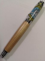
It looks fine the way it is, but maybe next time use a dark wood or maybe a dyed blue wood with it being a Royal Navy crest.
But still nice.


But still nice.


I would echo the views above, Mark - I like it as it is. I suspect your audience will too - the maple does feel quite nautical to me.
If you are looking for alternative ideas (to what is already a nice pen). I might consider segmenting the bottom using both white blank and maple to get the best of both worlds and break the lines up.
If you are looking for alternative ideas (to what is already a nice pen). I might consider segmenting the bottom using both white blank and maple to get the best of both worlds and break the lines up.
angelo49
Registered
I agree with 'geordie'
I would use a darker wood next time.
Otherwise, nicely done

I would use a darker wood next time.
Otherwise, nicely done


As it’s Navy use teak, it’s what the deckind was made of in warships.
PetrolP
Full Member
Look really good!
Definitely wood, I agree with Geordie and Angelo and try something dark.
Would set the cap off well!
Peter
Definitely wood, I agree with Geordie and Angelo and try something dark.
Would set the cap off well!
Peter
Penpal
Grand Master
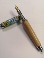
Mark your pic may be not able to convey the true colour of the pen body or the cast section. To confirm this and future questions like this a known sources or sources ie coloured could be included in the picture as a reference.
from what I can see from here you have used a suitable timber IMHO ask this question and you could get many different observations any time on any subject.
What I see is an honest blending using Maple ,I believe it is around a natural ships timber colour and neutral in grain but pleasing placing the emphasis on the Sawes made blank.Let the customer observe and report after all it is really between the customer and the custom made penmaker that pays the rent.
Kind regards mate.
Peter.
from what I can see from here you have used a suitable timber IMHO ask this question and you could get many different observations any time on any subject.
What I see is an honest blending using Maple ,I believe it is around a natural ships timber colour and neutral in grain but pleasing placing the emphasis on the Sawes made blank.Let the customer observe and report after all it is really between the customer and the custom made penmaker that pays the rent.

Kind regards mate.
Peter.
Neil
Fellow
As it’s Navy use teak, it’s what the deckind was made of in warships.
Bill, elm for the keel, lignum for the thrust block or belaying pins, spruce for the mast? No forget the mast!
wm460
Grand Master
- Joined
- Mar 16, 2013
- Posts
- 23,113
- First Name
- Mark
Looks good Mark, but would be interesting to see one in dark wood to see the difference.

Les ELm
Executive Member
IMHO, I would have used a darker wood and plating.
Les

Les
Bucks
Fellow
I quite think it would look pretty good in white resin, if the white matched the white on the cap!
Trust me to be different to everyone else, but you did ask for honest answers
Trust me to be different to everyone else, but you did ask for honest answers

AllenN
Fellow
Personally I prefer wood. To my eye resin on a pen like this makes it look too mass produced.
alan morrison
Fellow
My wife's designers eye would say to pick one of the colours in the top and use it in the nib section, which would mean resin or dyed wood.
I don't have the same eye as my wife, but would think that a nice light piece of holly would tie in with the white in the top, but what do I know.
Alan
I don't have the same eye as my wife, but would think that a nice light piece of holly would tie in with the white in the top, but what do I know.
Alan
alan morrison
Fellow
Or a bit of box to match the yellow?
Paul hd
Fellow
Hi Mark,
I like wood pens, I like resin pens and the mixed resin and wood style blanks.
But in this case I feel the body of the pen should be the same material of the cap.
Nice turning.
I like wood pens, I like resin pens and the mixed resin and wood style blanks.
But in this case I feel the body of the pen should be the same material of the cap.
Nice turning.

Pierre
Fellow
I'm incline to agree with Paul HD. I have found that none of my experiments in mixed acrylic/wood sold or were even liked unless it was a nice burl blended into acrylic. Acrylic upper with a wood lower or vice versa never worked for me. BUT if your client is a person who likes it then ignore all of us and go for it; after all the customer is King.
In all honesty I dont like the end result even though you have obviously worked hard and have made a great effort in the finishing, and I'm not too sure that changing the lower wood colour would be constructive, the acrylic design is too pale to call for a massive contrast. It would work better if the top design continued below with perhaps an undersea theme.
You did ask

Now that give him a wide range of choices Nel.Bill, elm for the keel, lignum for the thrust block or belaying pins, spruce for the mast? No forget the mast!

Mark James
Full Member
I think it looks great. More grain/darker color - thats fine also.


