-
Thanks for visiting The Penturners Forum today.
There are many features and resources that currently you are unable to see or access, either because you're not yet registered, or if you're already registered, because you're not logged in.
To gain full access to the forum, please log in or register now. Registration is completely free, it only takes a few seconds, and you can join our well established community of like-minded pen makers.
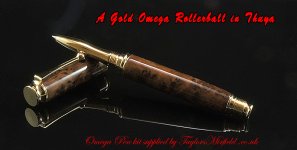
This is one for TaylorsMirfield !!!
- Thread starter Terry
- Start date
Terry tell em that it's gold dust . Stunning work mate.
 Vic
Vic
 Vic
Vic
- Joined
- Jan 31, 2013
- Posts
- 9,504
- First Name
- Terry
It is great to see how far you have come on with your photo's Terry, they are up there with the best my friend ..
Apart from the dust problem Jim but I'll cure this issue like I cured my rubbish photos from 12 months ago. I would like to thank all the input from forum members because without constructive criticism one can never improve !!!!


Lovely pics Terry great to see you improving so much mate.
The font is unreadable to my eyes but that don't mean it ain't pretty it means I need it in bold.
Is it dust or stuck pixels once again my eyes but I am sure I see some hotspots in there.
Another reason for using a white background init?
The font is unreadable to my eyes but that don't mean it ain't pretty it means I need it in bold.
Is it dust or stuck pixels once again my eyes but I am sure I see some hotspots in there.
Another reason for using a white background init?

I hope you don't mind, I took the time to edit it slightly. I touched up the colours/balance ever so slightly, removed the dust and added a 2pt stroke to the font. The reason for the stroke on the font is it makes it easier to read red on dark backgrounds(although my font isn't the same as yours you can still see what it does).
I was a web/graphic designer for 8 years and have been using photoshop since the 90's so if you need any help let me know

Very nice pen Terry. You'll soon be at Vic's level with your photos.


- Joined
- Jan 31, 2013
- Posts
- 9,504
- First Name
- Terry
Very nice pen Terry. You'll soon be at Vic's level with your photos.


